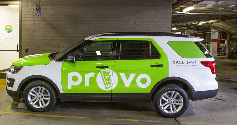
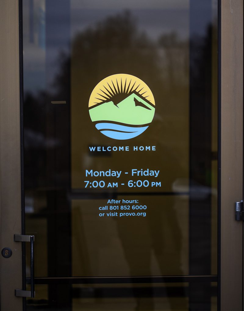
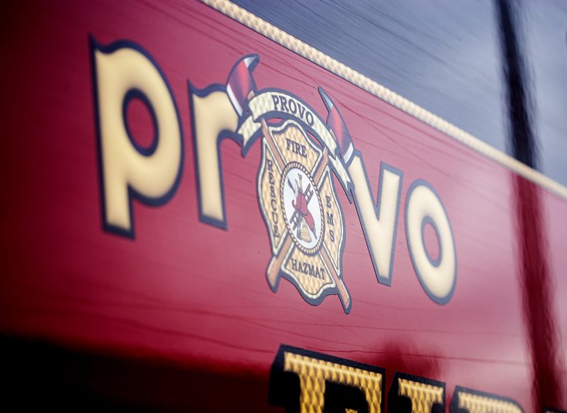
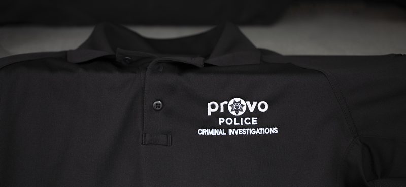
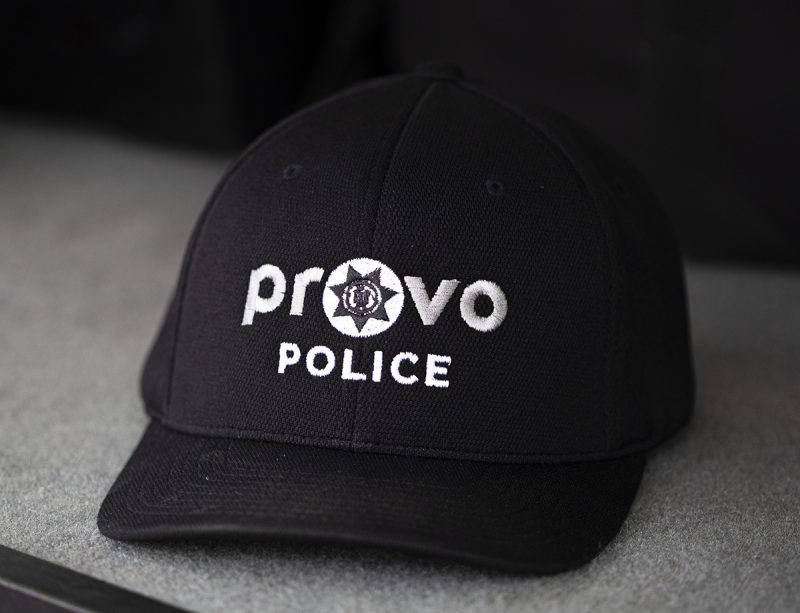
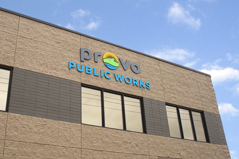
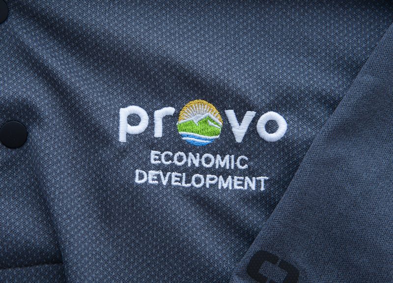
PROJECT SCOPE: Logo redesign, branding strategy for all of the cities entities, styleguide
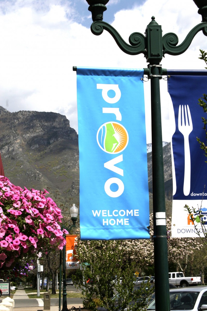
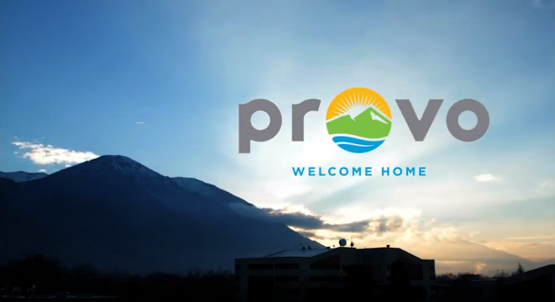
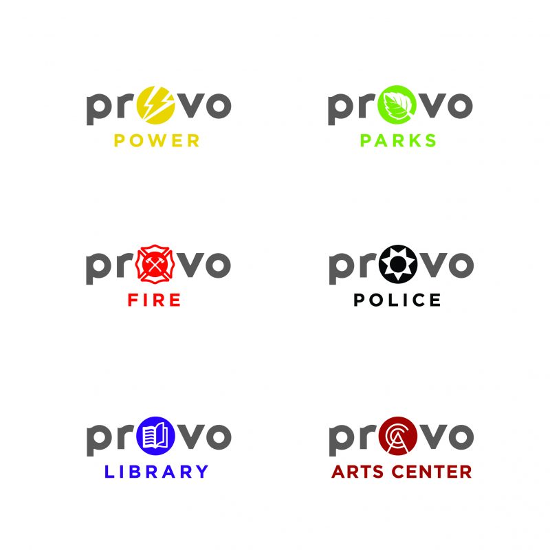
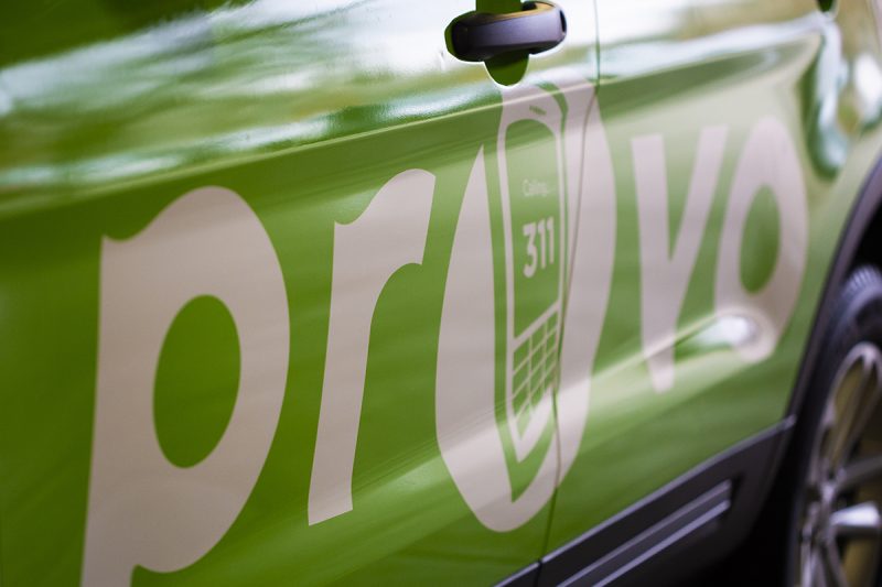
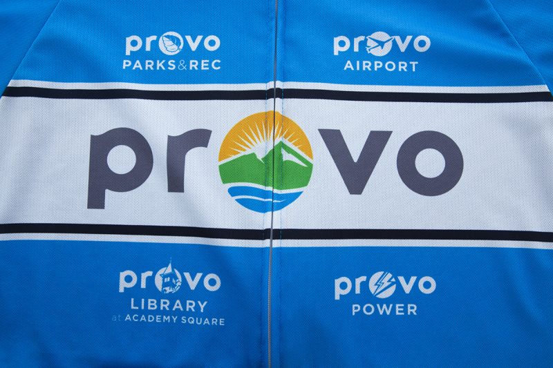
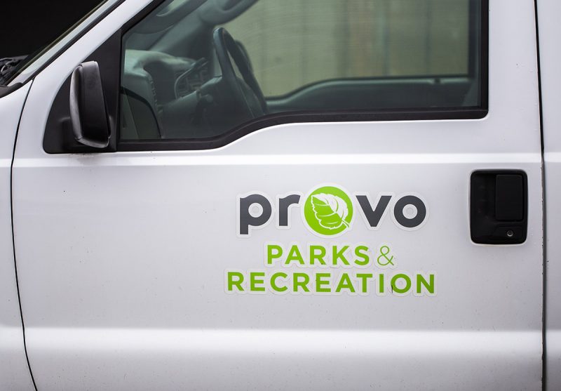
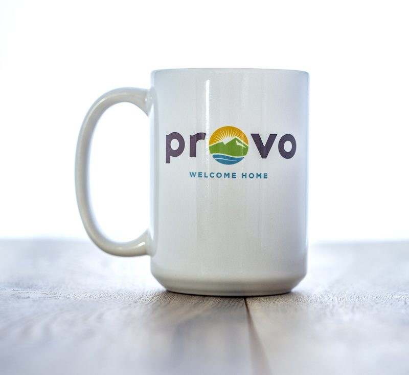
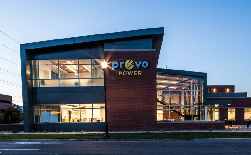
Welcome Home! R.E.D came to KOR with some amazing research and direction for the city. Our job was to interpret the research into a visual brand that encapsulated the feelings and thoughts that had been collected and presented to the Mayor and his team. The symmetry of the word PROVO allowed us to use the central O as an icon that could be changed out for each city department thus helping each to maintain a level of individuality within a cohesive overarching brand.